Resurface Wraps is an architectural wrap installer. If you’ve never heard of architectural wraps, you’re not alone—and that’s actually a big part of the story here. They install premium-grade film over commercial surfaces (elevators, doors, walls, reception areas, basically any surface in a corporate space) to transform the look of a property without the cost or downtime of a full renovation. The work is genuinely impressive. The brand wasn’t reflecting that as well as it could.
The Resurface team came in with the green light to rethink almost everything: positioning, visual system, the whole thing. That’s both freeing and a little terrifying. When everything’s on the table, every decision has to be intentional.
Before getting into anything visual, I had to figure out what I was actually up against. And what I found is that architectural wraps isn’t really an industry…it’s a market. There’s a difference.
An industry has rules, expectations, recognizable players, a shared vocabulary. A market is just people selling a thing. The architectural wraps space is the latter. Resurface was getting lumped in with vehicle wrappers, signage printers, film manufacturers, and a handful of actual competitors that all market themselves completely differently. Customers literally don’t know what to search for or how to compare options. Most of Resurface’s business came from referrals and self-generated leads, which makes sense why nobody could find them in the chaos.
So this wasn’t a case of “your brand needs to stand out from competitors.” It was “your brand needs to define what this category even looks like.” Big difference in strategy.
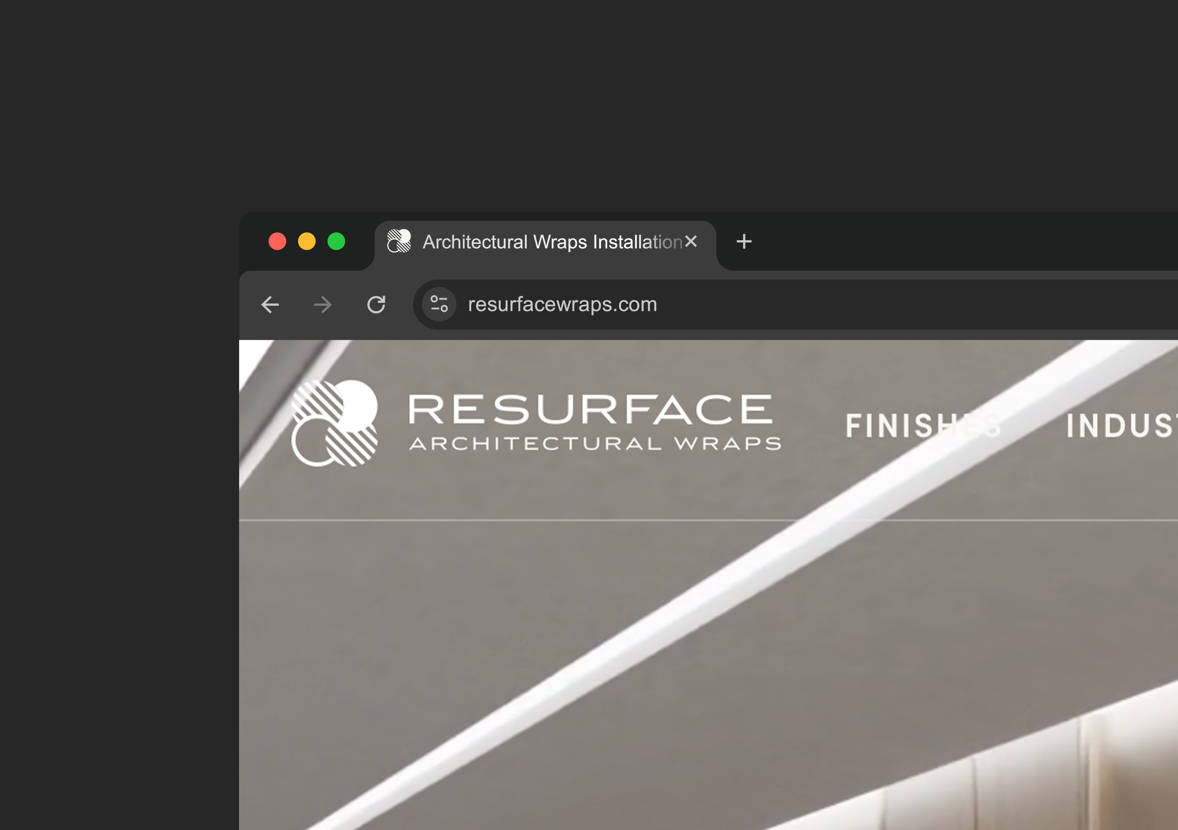
The original name was Resurface Wraps. Clean, but the word “Wraps” was doing too much heavy lifting and dragging the brand toward the vehicle wrap world, which is a completely different audience and aesthetic.
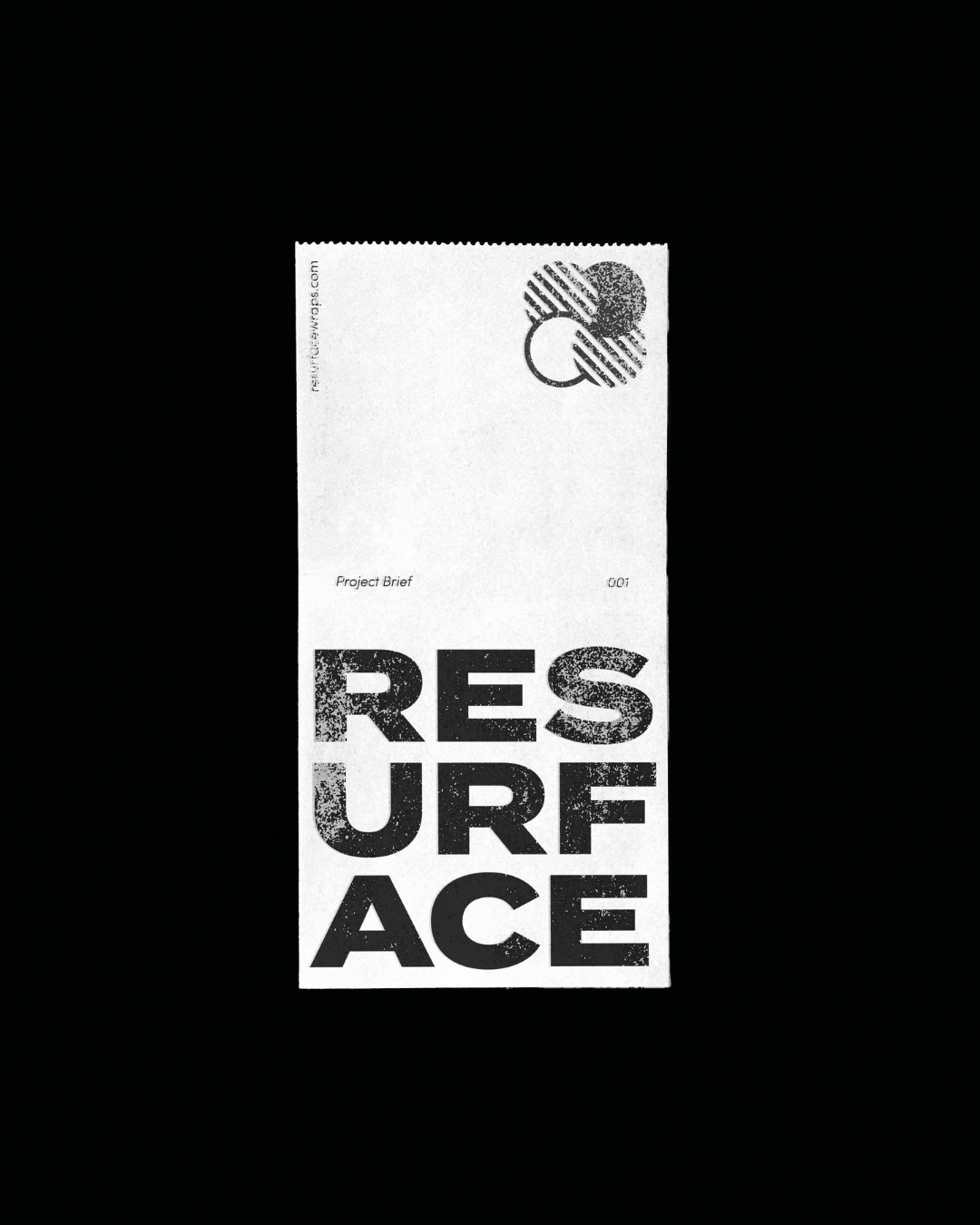
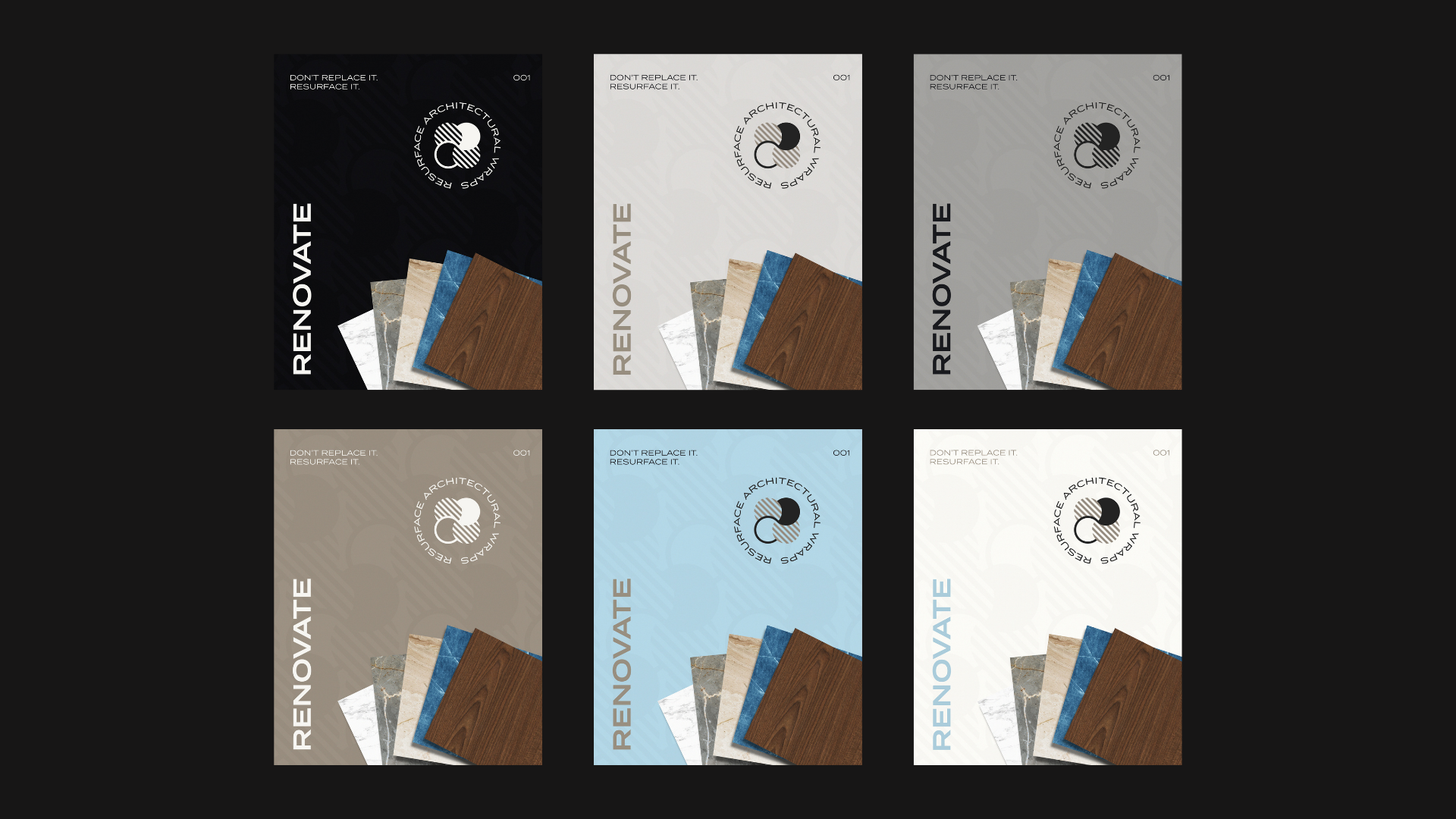
The recommendation: Resurface Architectural Wraps.
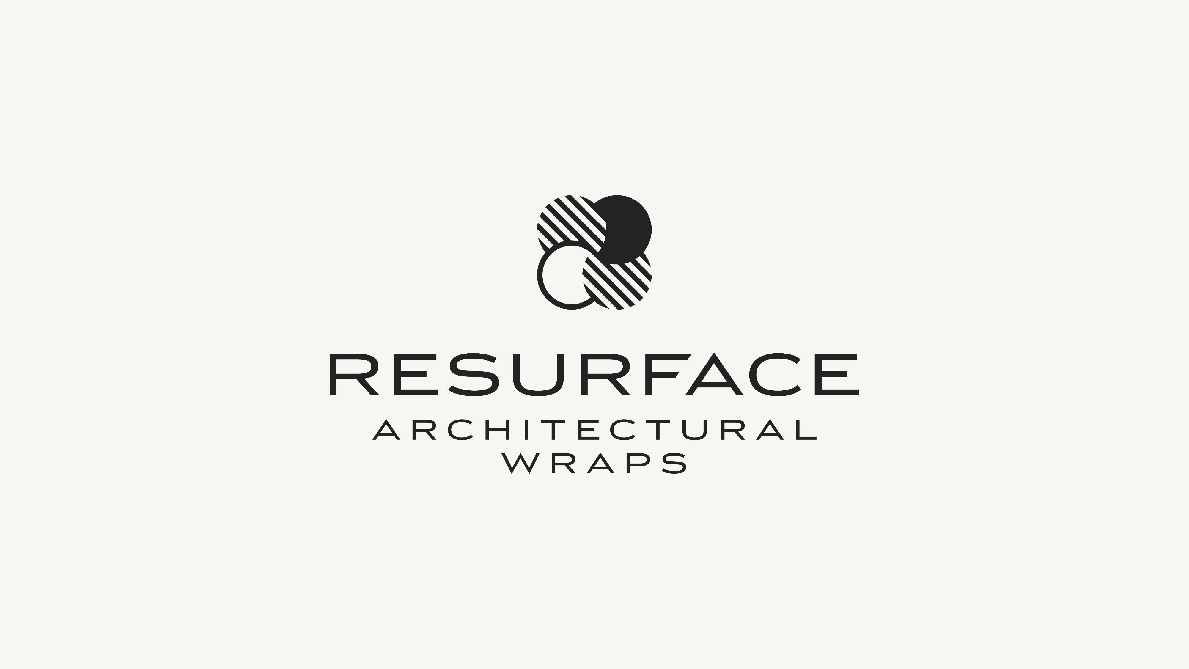
Small change, big shift. “Wraps” gets demoted from the headline of the name to a grounding line underneath. It’s still present, still searchable, but no longer the loudest word in the room. “Architectural” gets added in front of it, and that single word does most of the work. It immediately tells you who this is for (commercial properties, designers, architects) and who it’s not for (people who want flames on their Camaro).
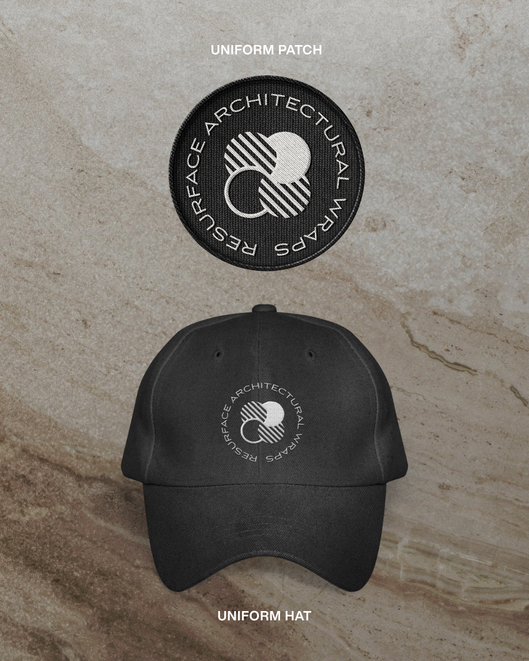
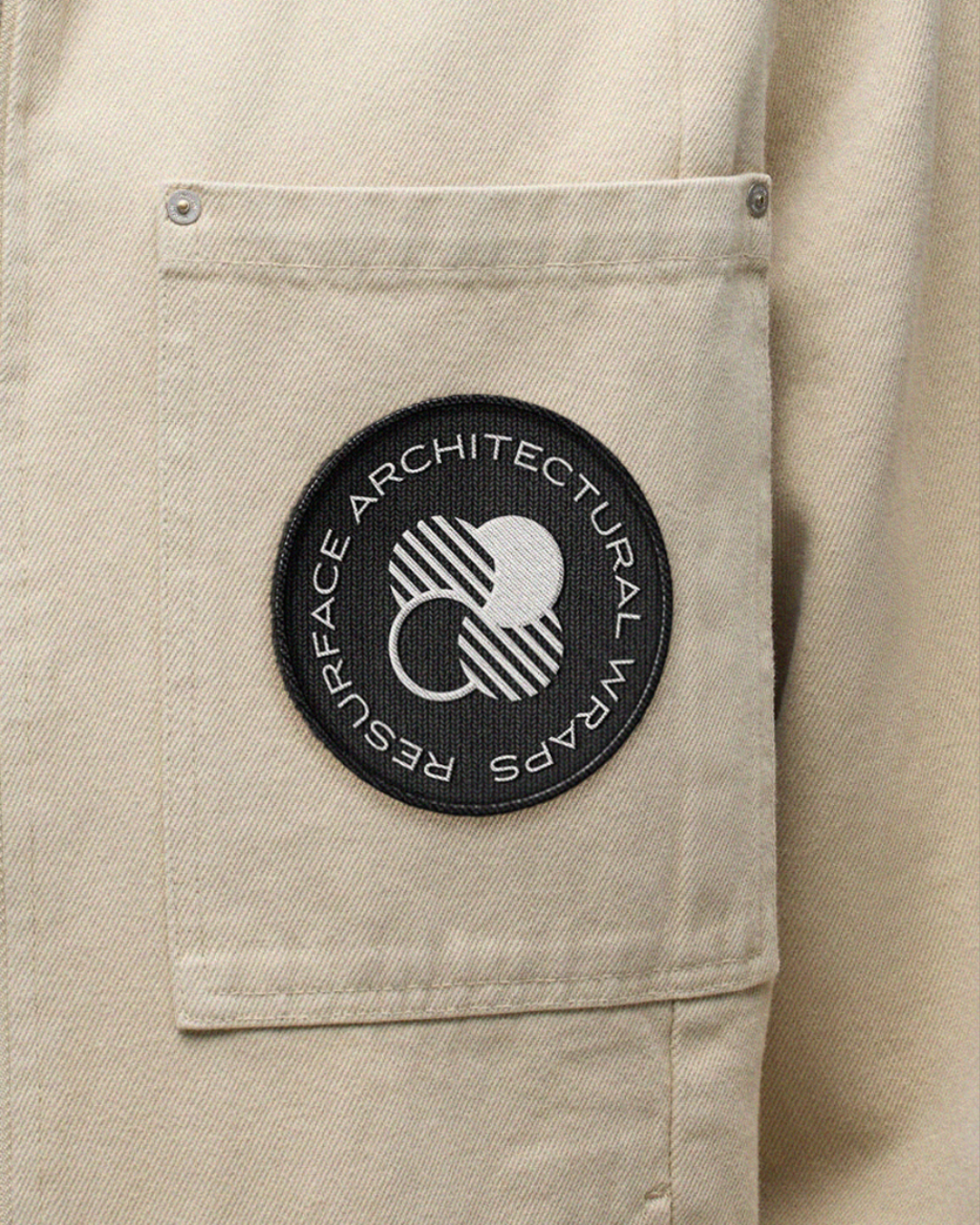
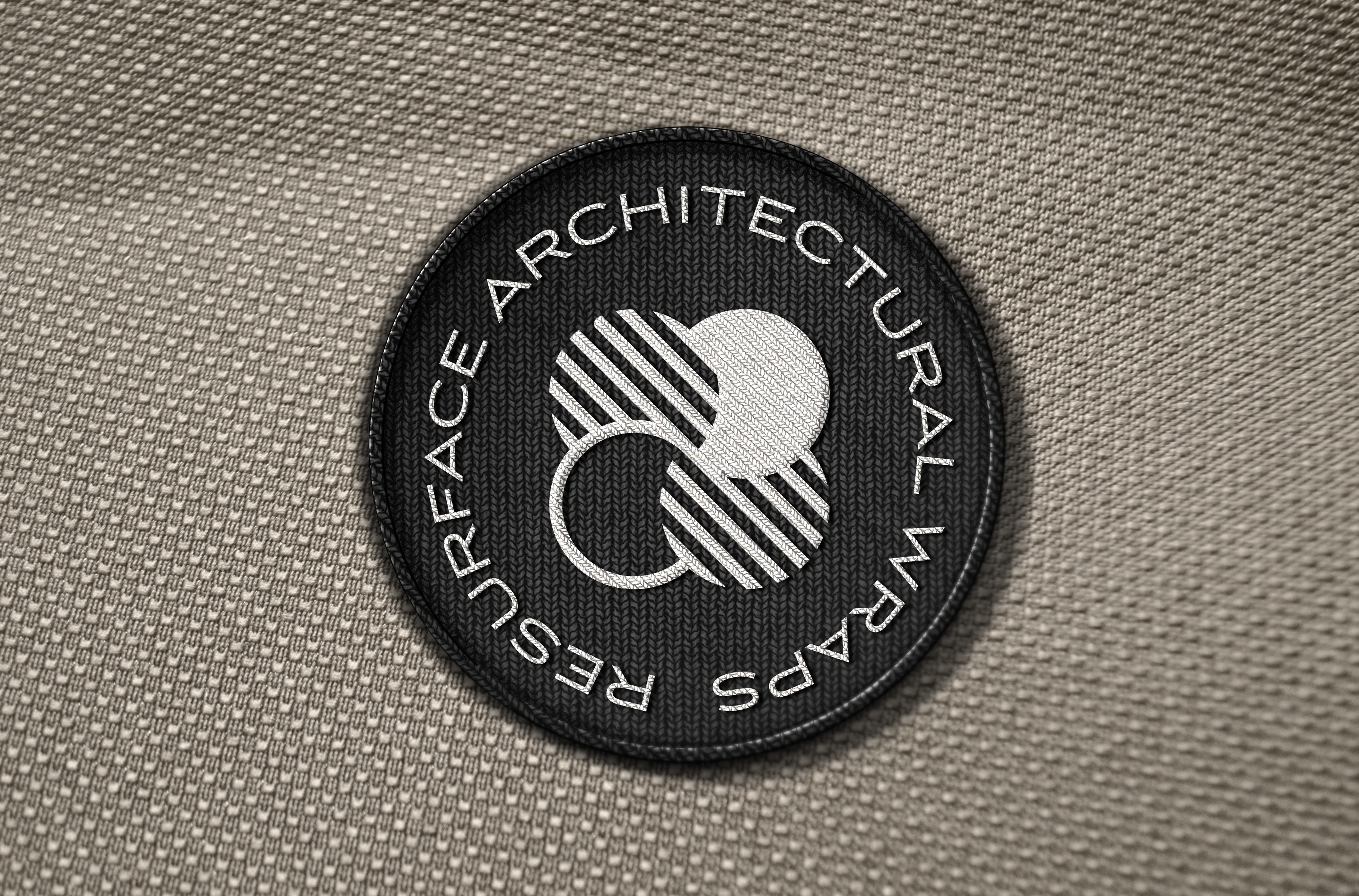
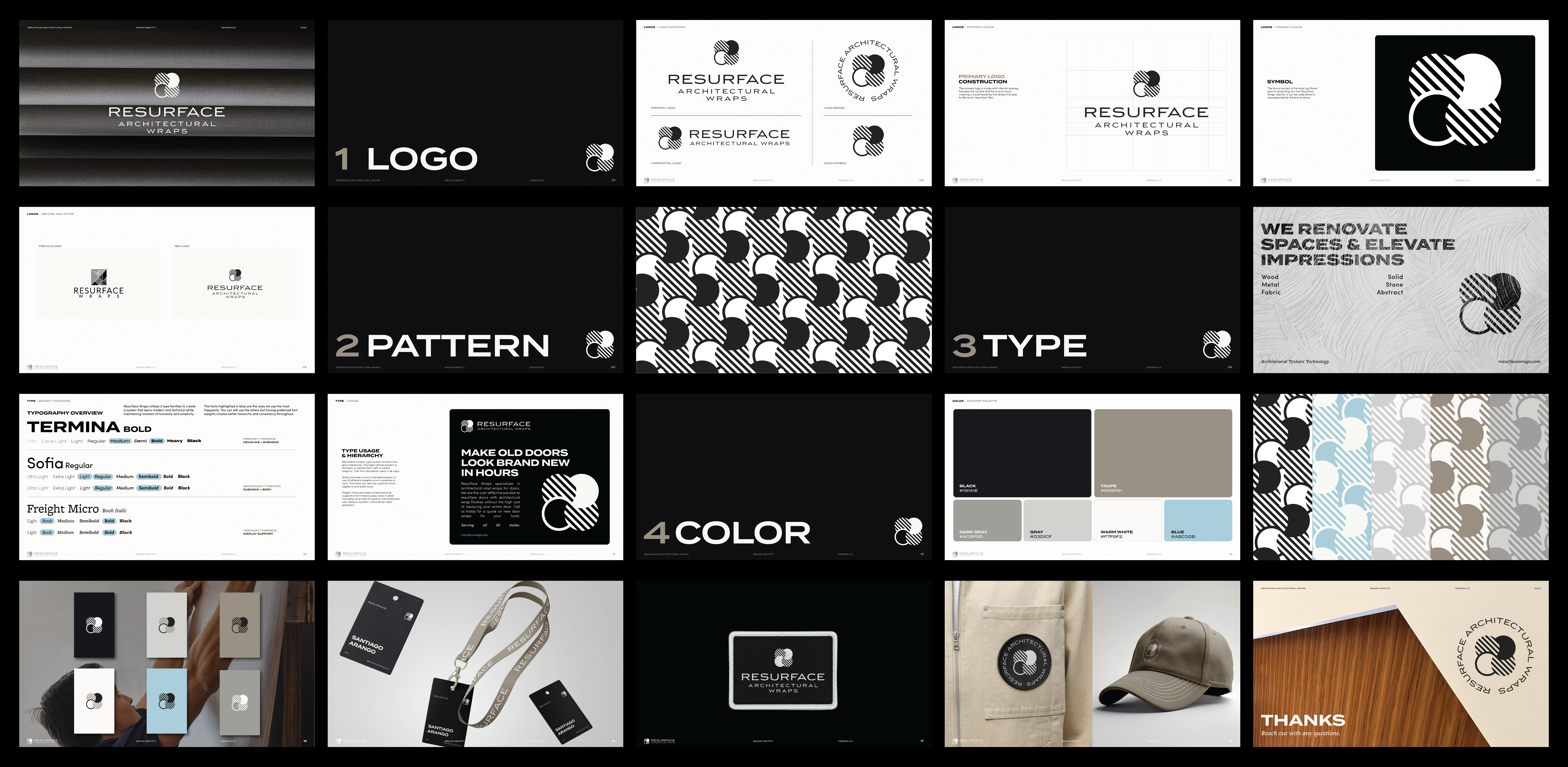
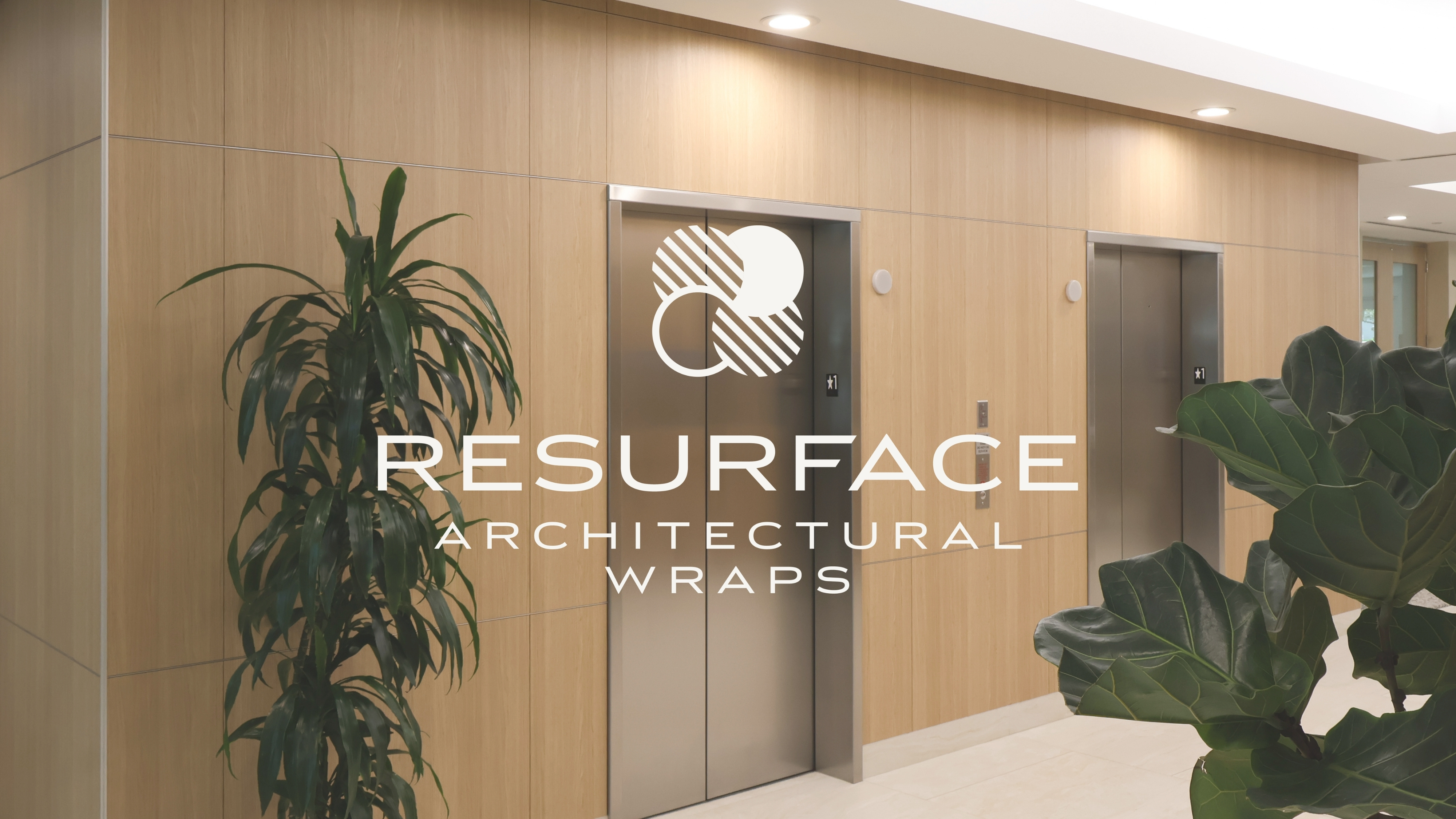
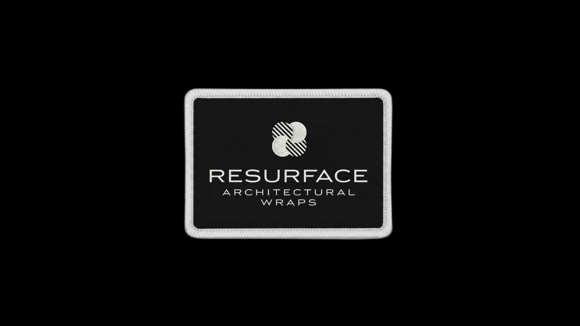
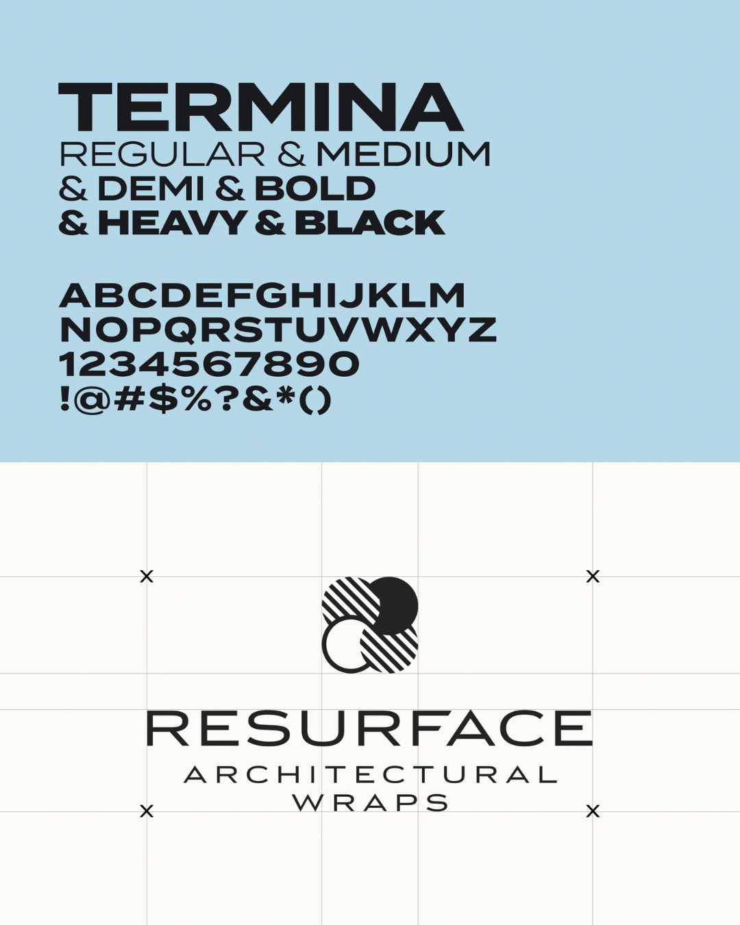
The symbol is built from overlapping circles with diagonal striping and a geometric weight to it. It feels like materials, like layers, like something tactile (which is the whole point). The wordmark uses a clean, modern sans that feels architectural without trying too hard.
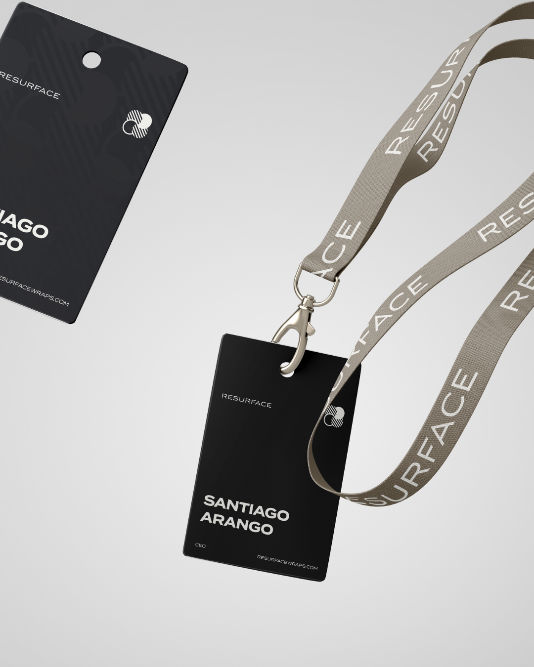
I also designed a circular badge version of the logo for stamps, embossing, social avatars, and any context where the horizontal lockup doesn’t fit.
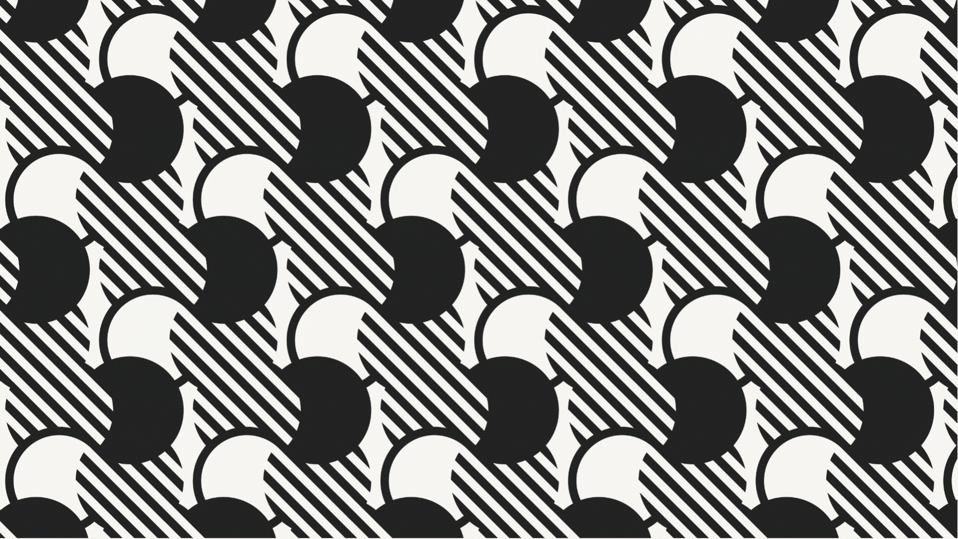
Oh yeah, there’s also a brand pattern. It’s built directly from the symbol and repeats like a tile pattern. This works great for envelope liners, folder interiors, texture overlays, and it’s a subtle nod to the architectural vinyl that the resurface team uses in their projects.
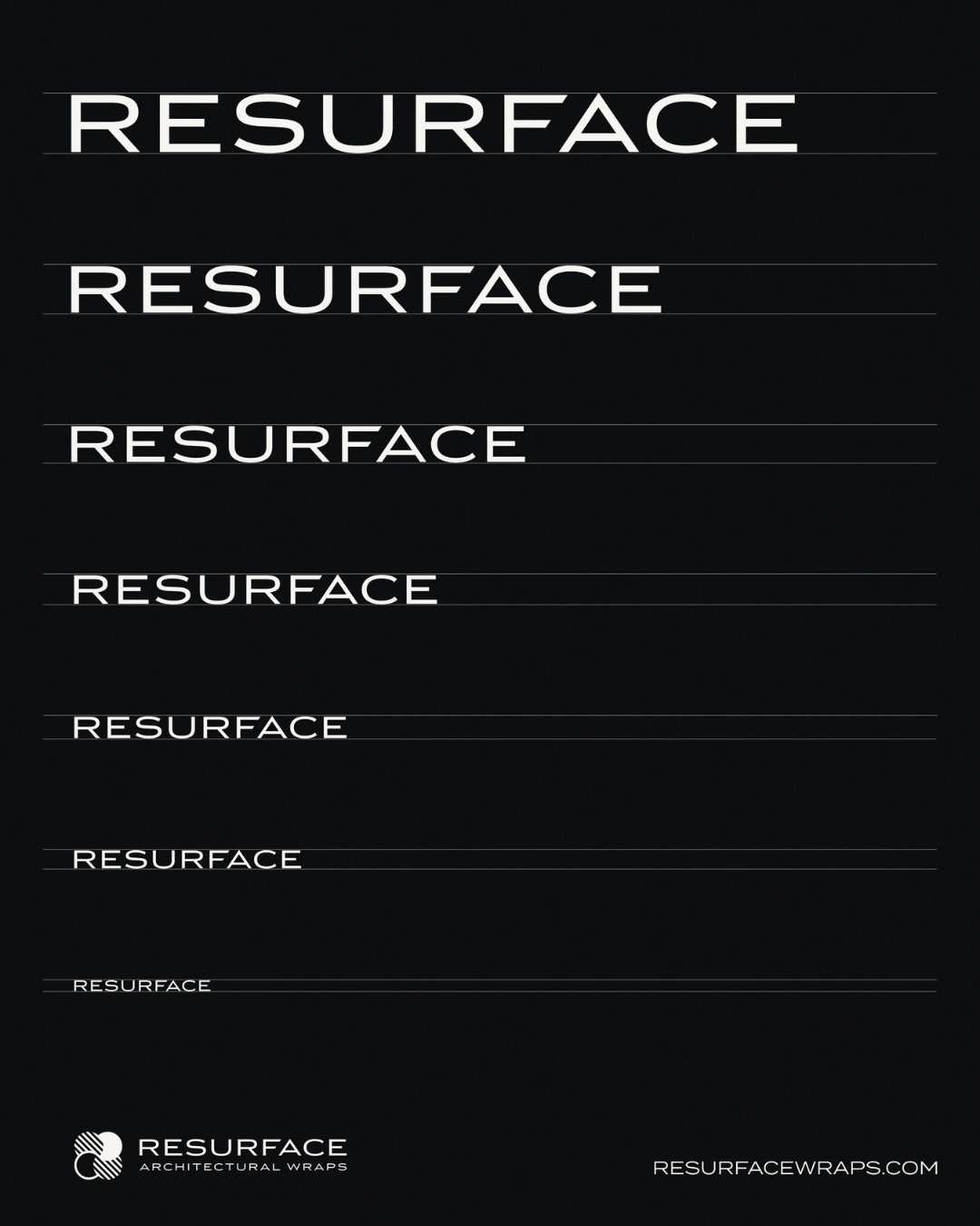
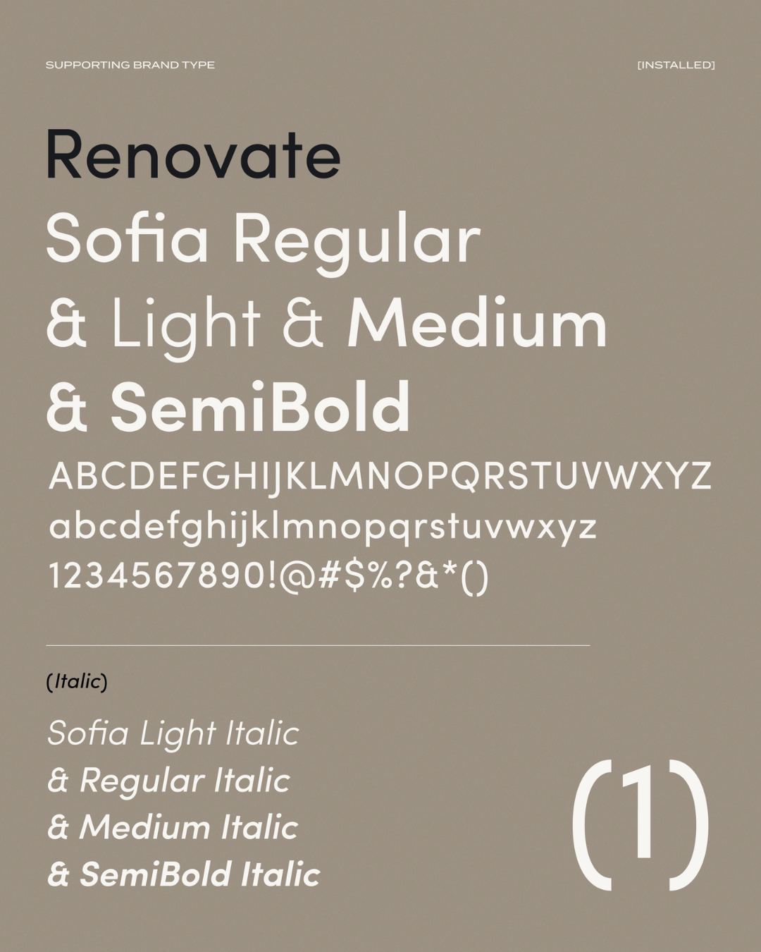
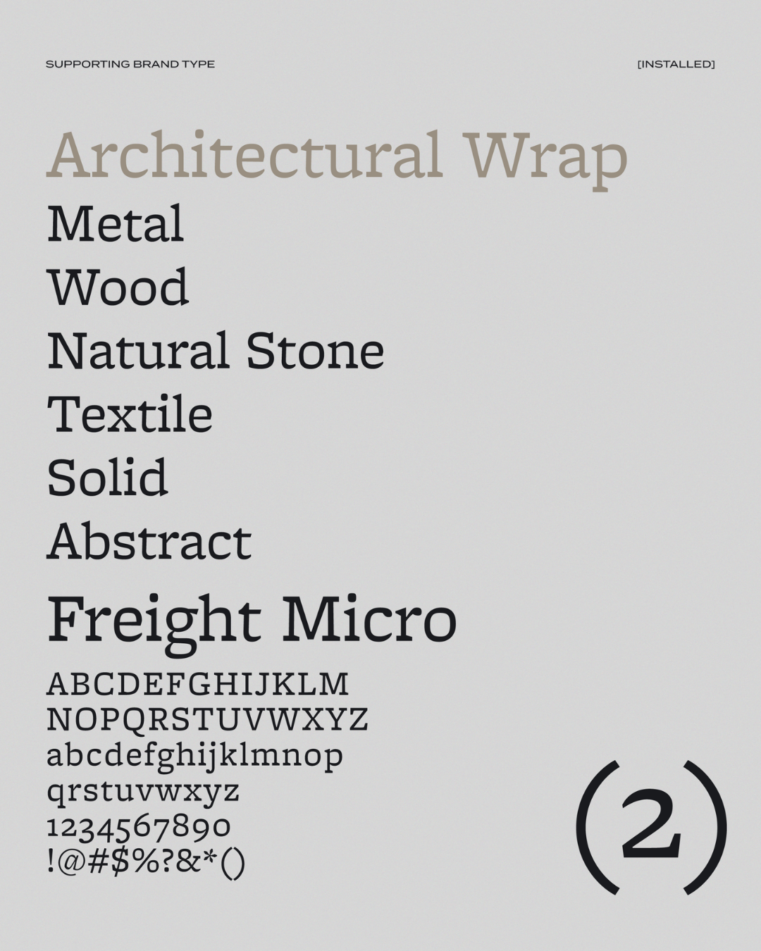
There are three typefaces in the Resurface system. The first one is Termina: geometric, confident, slightly architectural in its proportions. This one carries the weight in headlines. The secondary typeface is Sofia. Sofia is a friendlier sans for body copy and supporting text, which keeps things from feeling cold. Freight Micro is the third typeface. A serif for the occasional editorial moment. Adds a little prestige when the brand needs to feel premium.
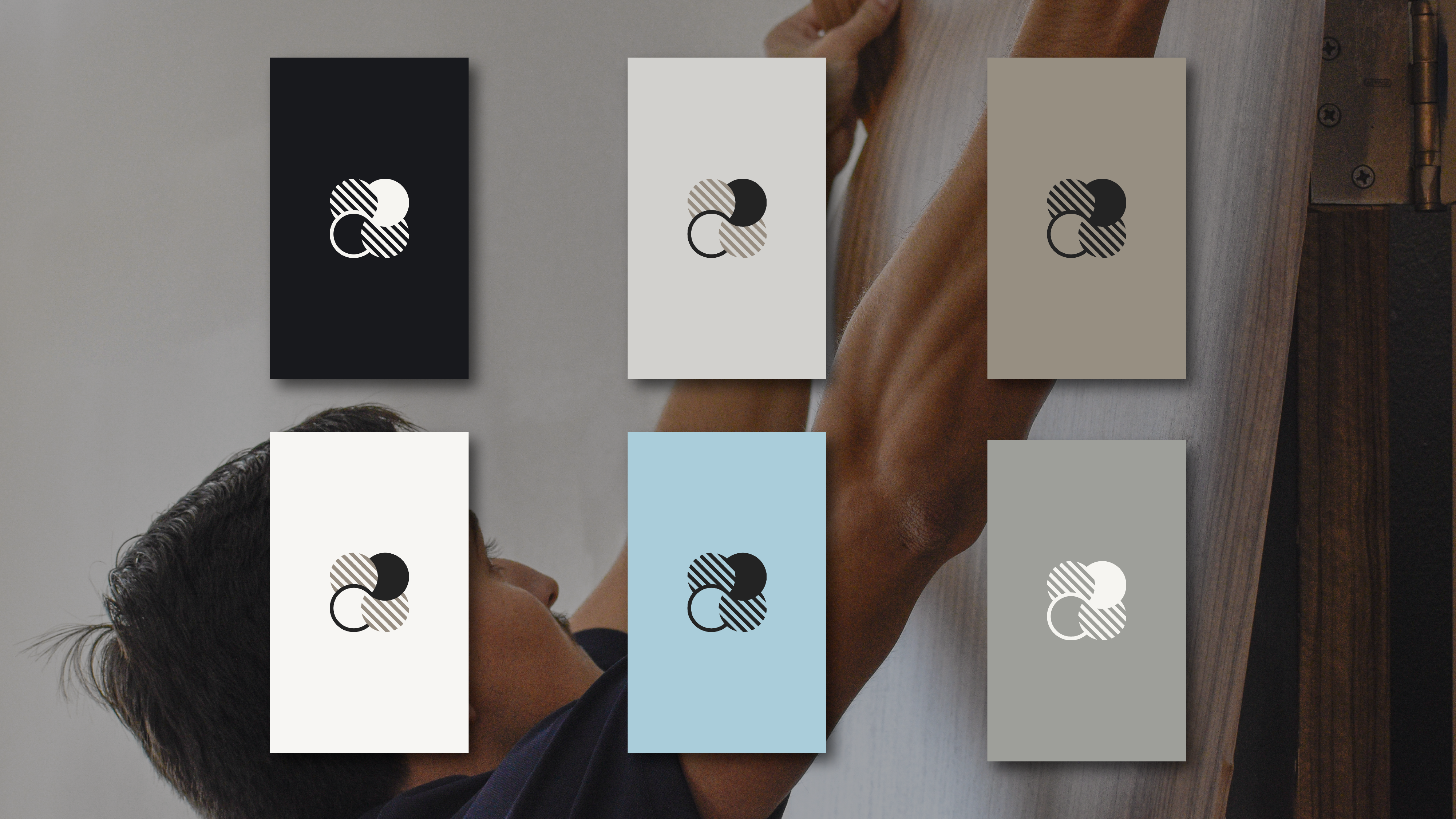
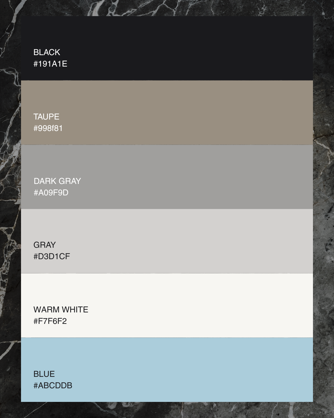
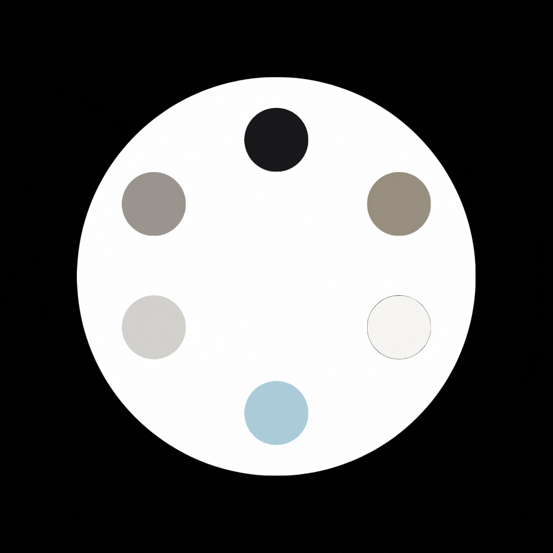
I pulled the palette away from the bright, saturated colors you see all over the wrap industry (which scream “vehicle” or “signage”). Instead: a deep near-black, a warm taupe, two tones of gray, a warm off-white, and a cool muted blue.
It feels like an architecture firm’s palette, or an interior design studio. Which is exactly the room I wanted Resurface to be standing in.
If I had to summarize the whole project in one line: I wasn’t just rebranding a business, I was defining what a category should look like. Resurface had the product, the craft, and the client list to lead the architectural wraps space, but the team needed a brand that gave it permission to act like the leader. That’s what Resurface Architectural Wraps does.
Others will inevitably follow.