I absolutely love jewelry and gemstones, and I have always wanted to design pieces or a fine jewelry brand’s visual identity. I got lucky earlier this year when Lisa, the founder of Cuey, reached out to build the brand design. Most of my previous projects have been pretty straightforward. This time, I had a pretty special task: design a brand that doesn’t exist yet. No previous logo, no colors, no brand history. This is exactly the kind of project that makes my brain all tingly (in a good way).

Okay, so even though the brand doesn’t exist publicly yet, I did receive a few things—a name, some images, and the reason why the brand is even a thing.
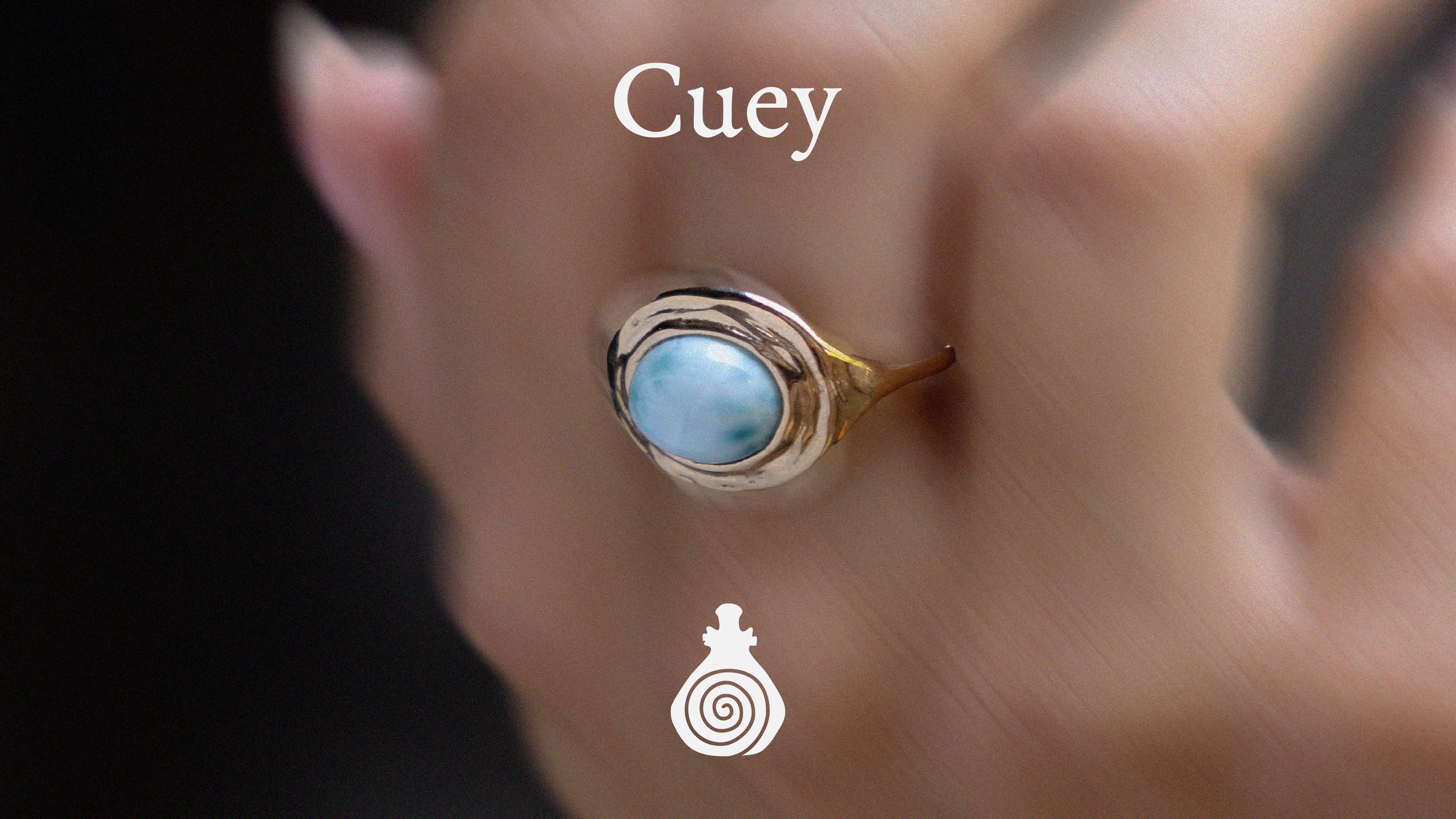
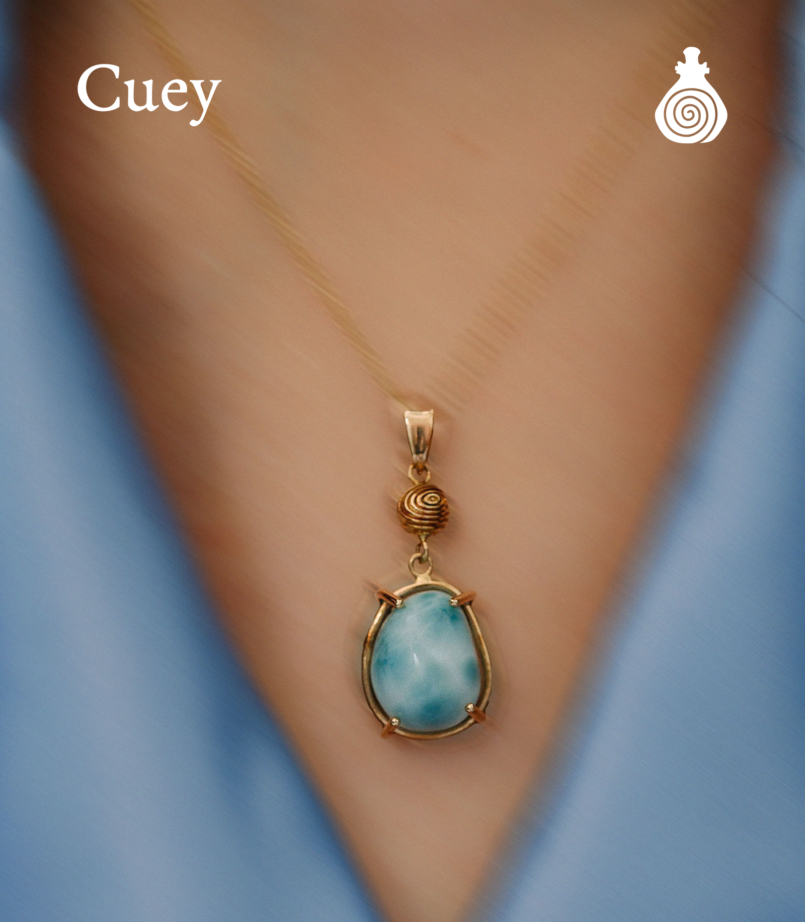
Cuey is rooted in Dominican heritage, drawing inspiration from the often-forgotten indigenous Taíno culture and the natural beauty of the island shared by the Dominican Republic and Haiti. The name, Cuey (qu-ay), means sacred object in the Taíno-Arawakan language. Lisa’s goal with Cuey is to create handmade, one-of-a-kind pieces that become heirlooms that travel through generations.
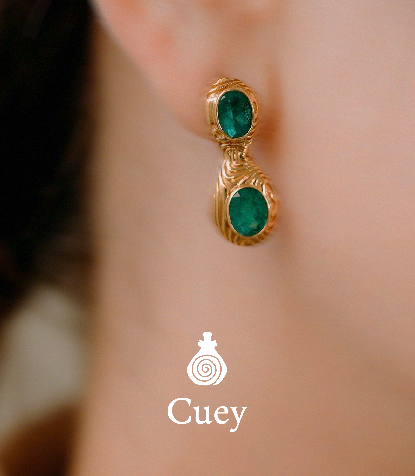
For the jewelry, Lisa wants to focus mainly on incorporating larimar, a cultural symbol of the DR. Larimar is a rare, blue kind of pectolite known for its ocean-like patterns and prized for its exclusivity; this stone can only be found in a single mountainside near the Dominican Province of Barahona. With this information, I knew how to approach this project and decided to dive right in.
My initial research consisted of trying to find as many examples of Dominican-Taíno culture as possible. Being Dominican-born myself, I understand how much of the pre-colonial indigenous culture has been forgotten (and purposely erased) from DR’s history since the Spanish arrived in the late 15th century. This makes the project even more meaningful to me.
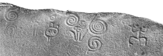
While doing my research, I came across Taíno artworks and artifacts found on the island. Two things stood out to me—traditional pottery and symbols that were carved into vases, jewelry, and stone.
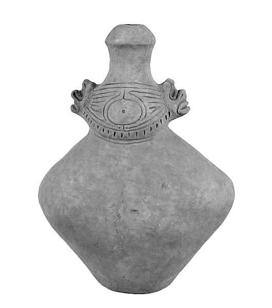
I tried mixing different symbols together, trying to spell the brand name in a similar style to the stone carvings, and recreating the pottery in a “modern” way, until I ended up with my perfect combination of a vase and a spiral.
The vase, called a potiza, is one of many Taíno ceramic works. These handmade vases typically depicted faces, symbols, male and female body parts, and were given to women by men as a symbol of love and dedication.
The spiral, a prevalent symbol across Taíno art and petroglyphs, is said to have represented the concept of reincarnation and immortality of the spirit, offering comfort and meaning to those contemplating the mysteries of life and death.
I really wanted to do something different, and get away from what many fine jewelry brands do nowadays, which is to create some sort of initial monogram that could be a wedding invitation logo. BORING!

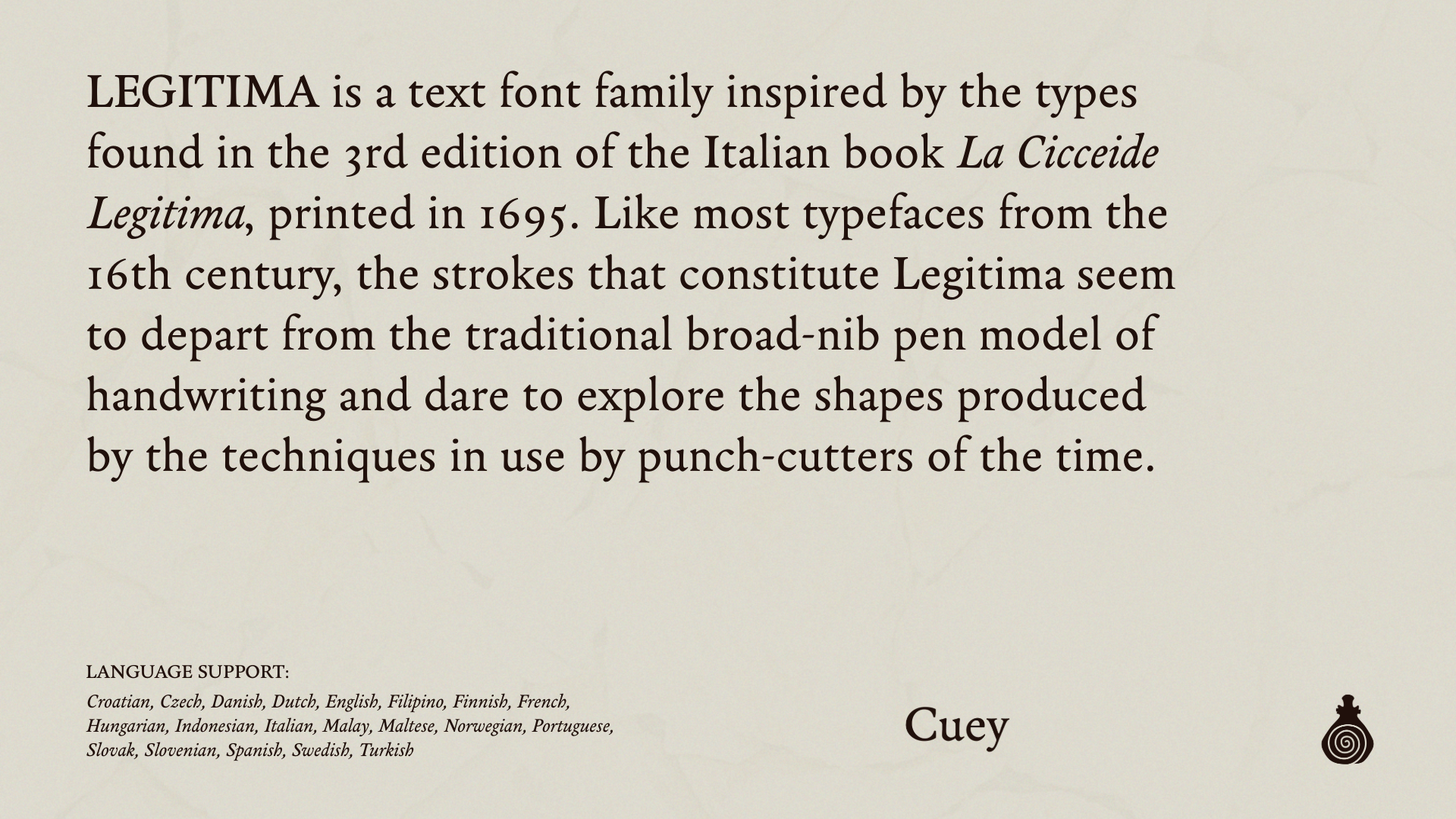
From there, I moved on to the wordmark. I really love non-serif fonts, and was almost sure I would pick one for this brand. I landed on Legitima, which just looked so perfect spelling out the brand name. I like how the letters aren’t completely perfect, like how the little marks at the end of the capital “T” fall downward to the left instead of straight down. These tiny details do make a difference. Legitima is inviting. There’s something very organic and grounded about this font, which is perfect for Cuey’s branding.
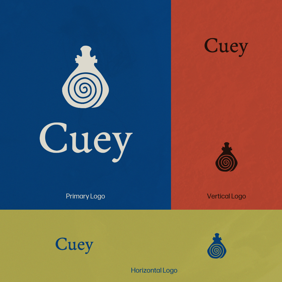
I came up with some variations so the wordmark didn’t feel too restrictive. This way, it can be used in different ways for social campaigns, catalogs, packaging, and the brand’s future website.
Honestly, font pairings are my least favorite part of branding projects, so I’ll keep this part short and sweet. I wanted to keep Legitima as part of the brand’s font pack, but it doesn’t have any variety. Plus, I needed something that’s easier to read in print/web design, and that’s where Forma DJR came in perfectly. It feels fresh, open, friendly, and has a great weight range.
This is where things really started to get fun for me. From my original conversation with Lisa, I knew I had to find colors from somewhere in the Caribbean. After trying some really great tropical colors, I had to stop for a second and dial it back—did I really want to use these bright, high-saturation hues for a brand that feels more personal, understated, and grounded? No, it’s not like me to go for the typical approach.
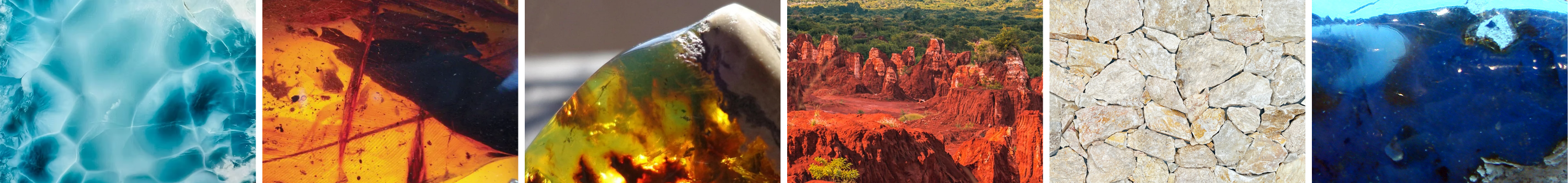
I had to find inspiration somewhere else and that’s where it hit me: Start with larimar. Genuinely, I don’t know why this wasn’t my first idea. Cuey will use larimar in many of their pieces, so I used the gem to pull the main brand color. Before larimar, the DR was known for its incredible amber specimens, especially rare varieties like blue, green and red amber. When I remembered that, I decided to create the entire color palette from hues found in natural Dominican minerals and the landscapes.
Again, I didn’t want extreme saturation or super vibrant colors, but I still needed enough variety to give the brand personality. Colors can be really intimidating sometimes, so I made sure to include some neutrals to keep everything grounded. Listen, I know I’m not reinventing anything here, but so far, it’s all making so much sense.
Creating the brand elements for a non-traditional fine jewelry brand was tricky, since the goal was to keep it as simple as possible. In theory, that should be easy, but simple branding can quickly become boring. Also, I’m not particularly a minimalist.
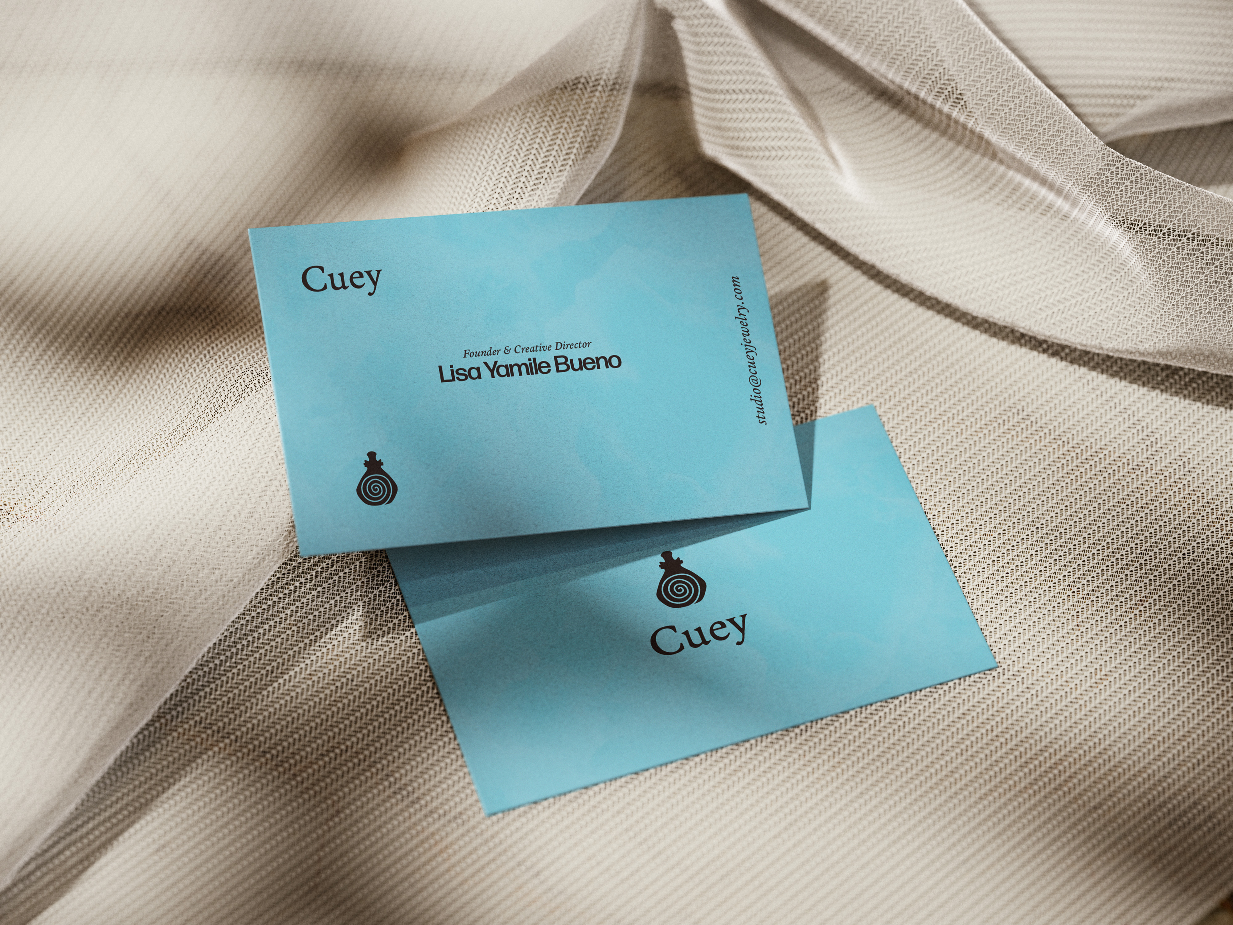
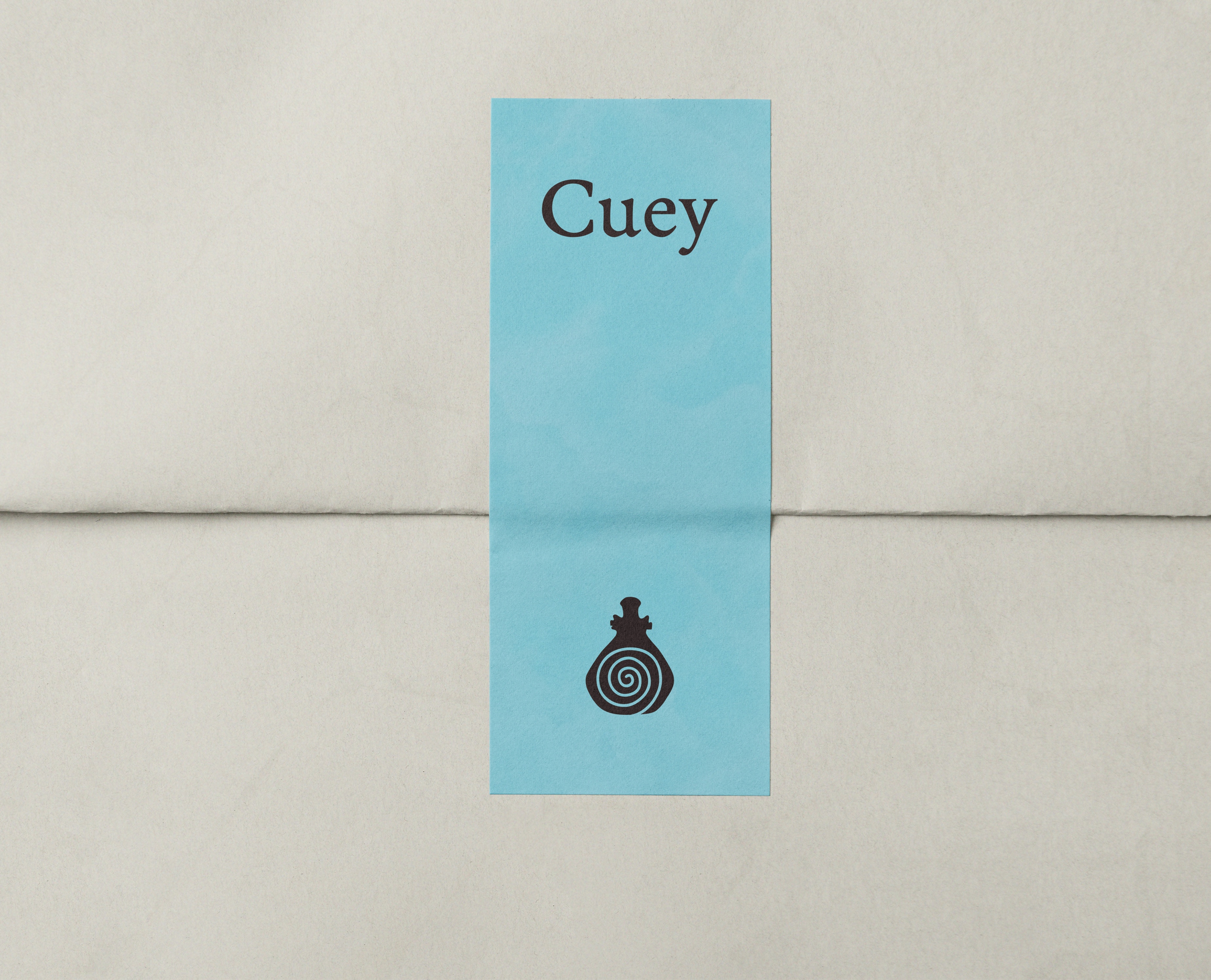
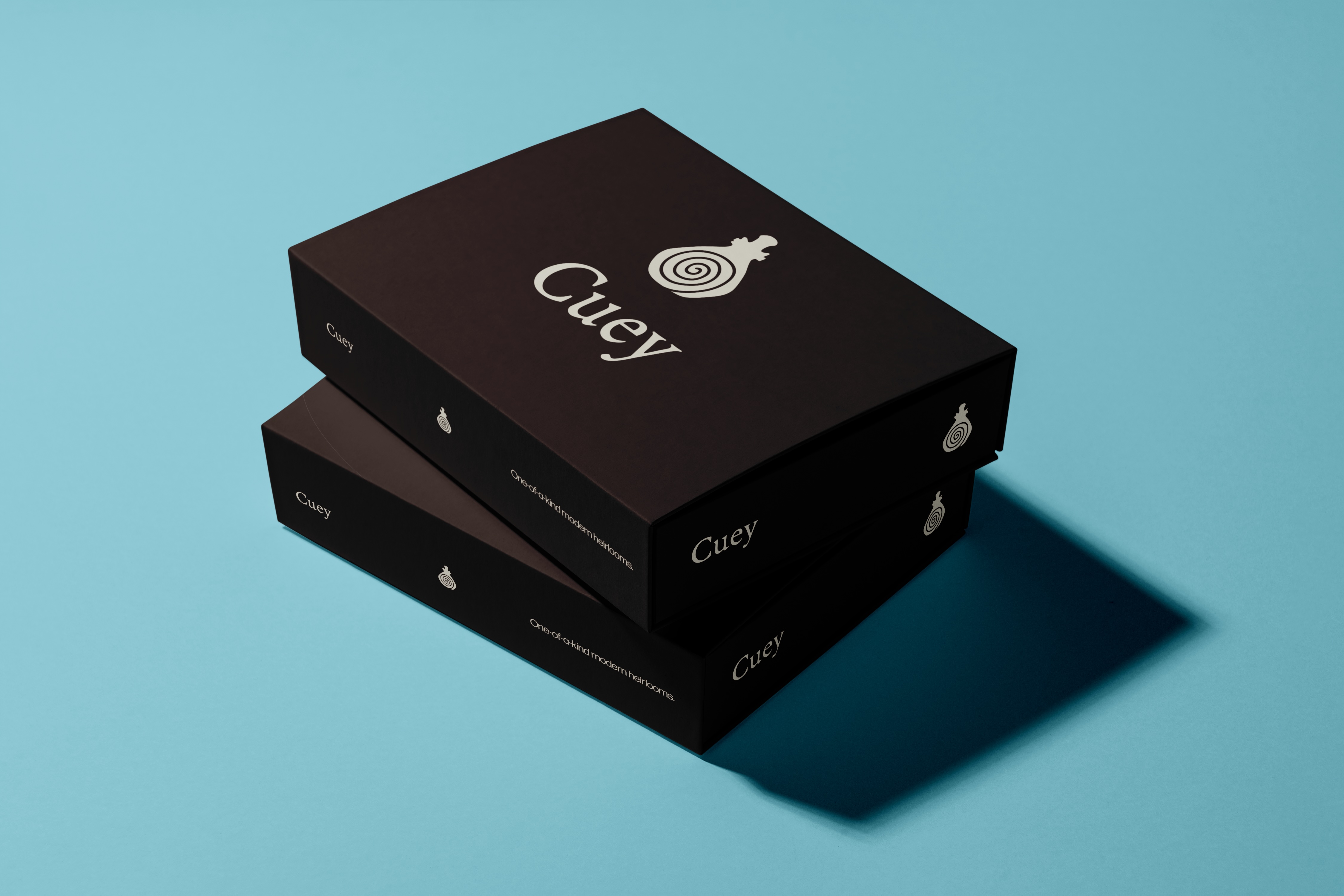
I made some business cards, designed a packing box, and even mocked up the wrapping details. For me, the most important part of a brand is the feelings that the audience might get when interacting with the brand outside of the products themselves.
This is all I’ve created for Cuey. Luckily, I will continue to work with Lisa until the brand launch; I’m currently designing the website and social media assets (to be added soon). Stay tuned!