First, I want to clarify that this is not my freelance work, and I am employed at Champlain during this project. This changes my process just a bit.
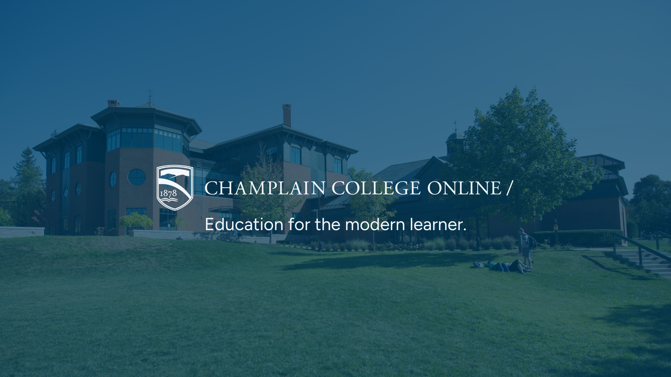
Champlain College Online (CCO) is a subdivision of Champlain College, a private non-profit higher ed institution in Burlington, VT. CCO has been active since 1993, making it one of the first colleges to start offering online programs. While CCO’s identity is directly tied its Vermont history, the team wanted the visual identity to stand out from its campus branding.
Overall, this isn’t really a “rebrand” project, but a brand identity update. However, I had to be very strategic and make sure I didn’t stray too far from the Champlain College that people know. I couldn’t change two things—logo and primary brand color. So, here is the visual expression of the brand:

Vermont is really known for its natural beauty. Amazing forests and hiking trails, snow-covered mountains in the Winter, Lake Champlain’s busy boating Summer season, and a pretty relaxing outdoors-y vibe. Using pictures of Champlain’s campus, I picked out colors that be seen around the campus grounds.
CCO’s students are online students. Only a small percentage get to experience the atmosphere in Burlington when they travel for graduation, but it’s a very small number. Who knows how many other eventually travel to Vermont. Anyway, using colors from campus pictures is my way of connecting the online students to this pretty magnificent place. I visited once, it’s beautiful.
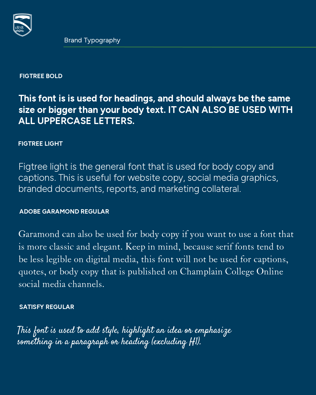
The brand guide I created wasn’t just for the marketing team. This was going to be shared with eLearning, Admissions, Academics, Faculty, and external partners, which means that I needed to explain the branding clearly and create a set of rules that are easy to understand (and follow).
For all elements of the brand update, I included proper and improper usage examples for the team to see.
There was actually a vote between the campus and online marketing teams to choose the final brand fonts—this is something that both team wanted to keep consistent across the institutional brand.
The brand patterns connect CCO to its roots in the State of Vermont. The patterns resemble the landscape of the state, simulating the mountain landscapes and slopes visited by nearly 4 million people yearly.
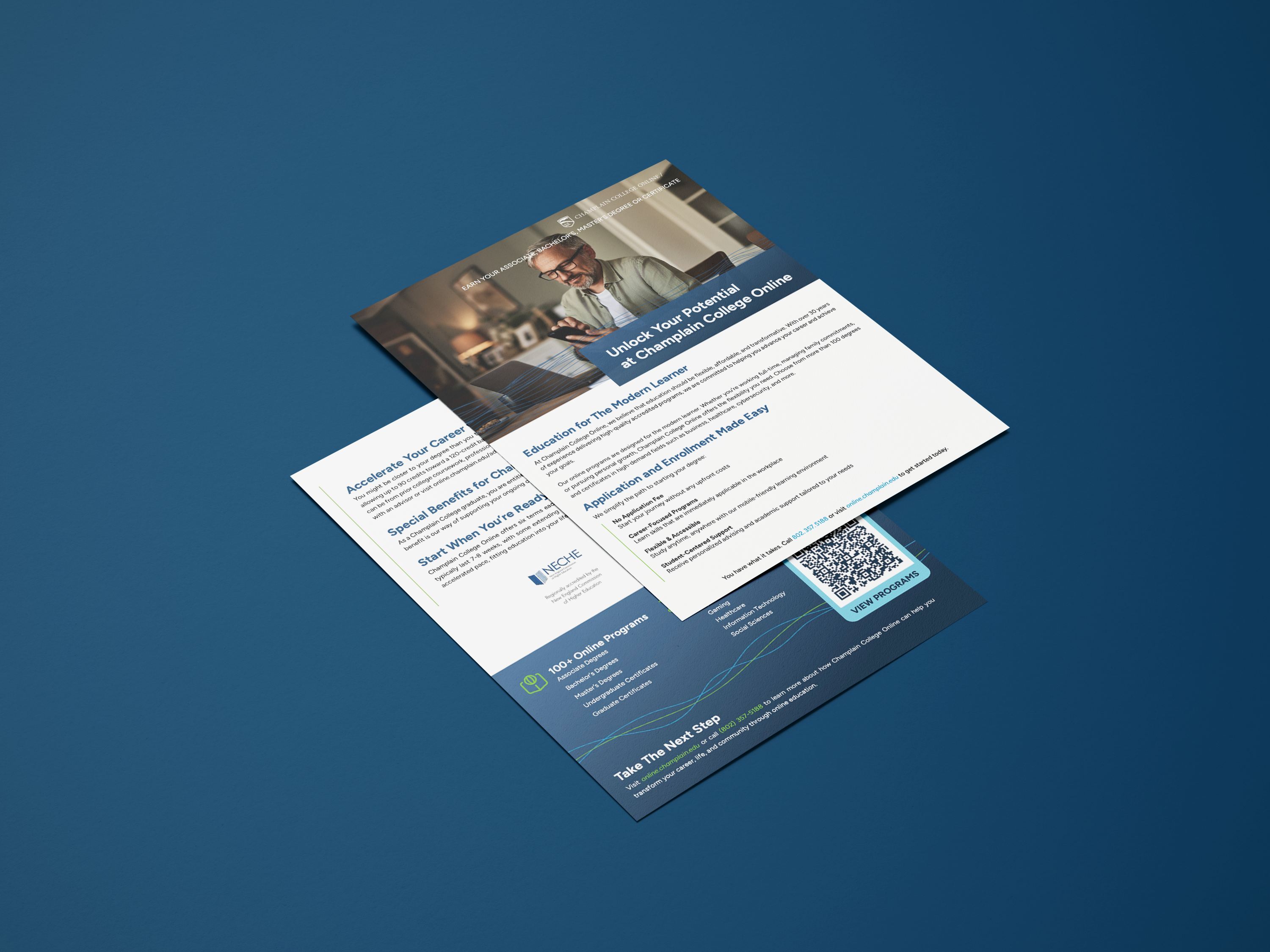
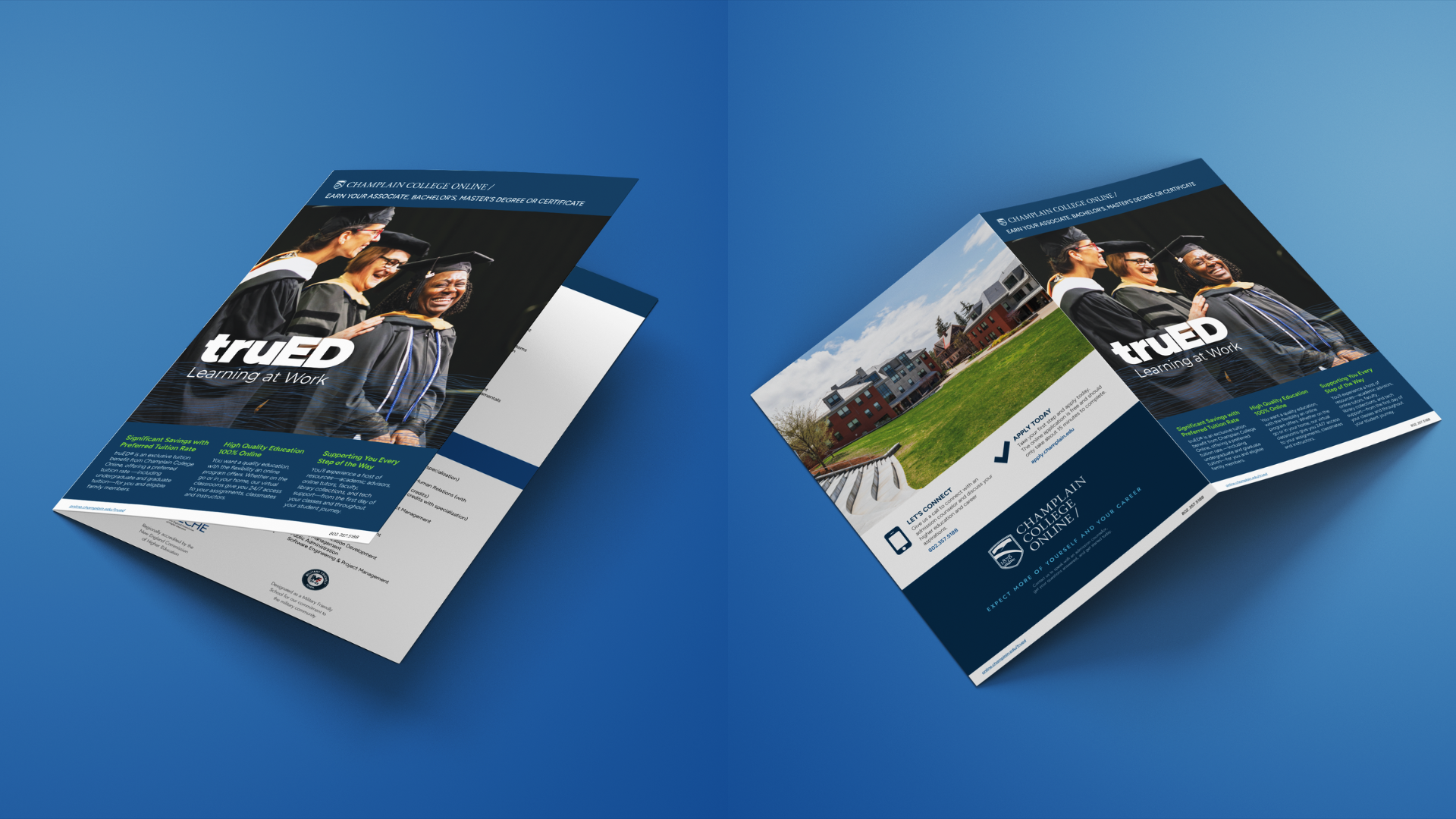
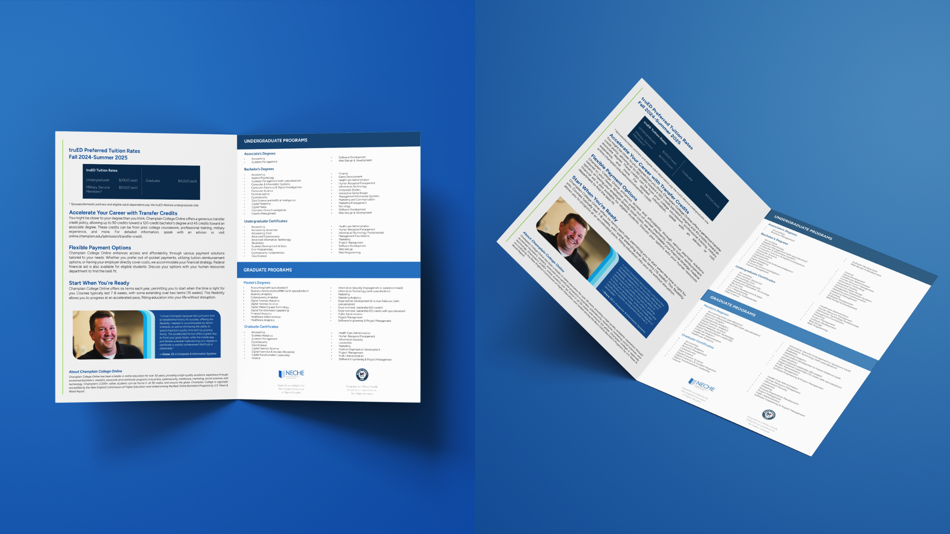
Once the core brand identity was decided, it was truly all about experimentation and having fun. I began by updating the print materials, which hadn’t been updated in almost 2 years.
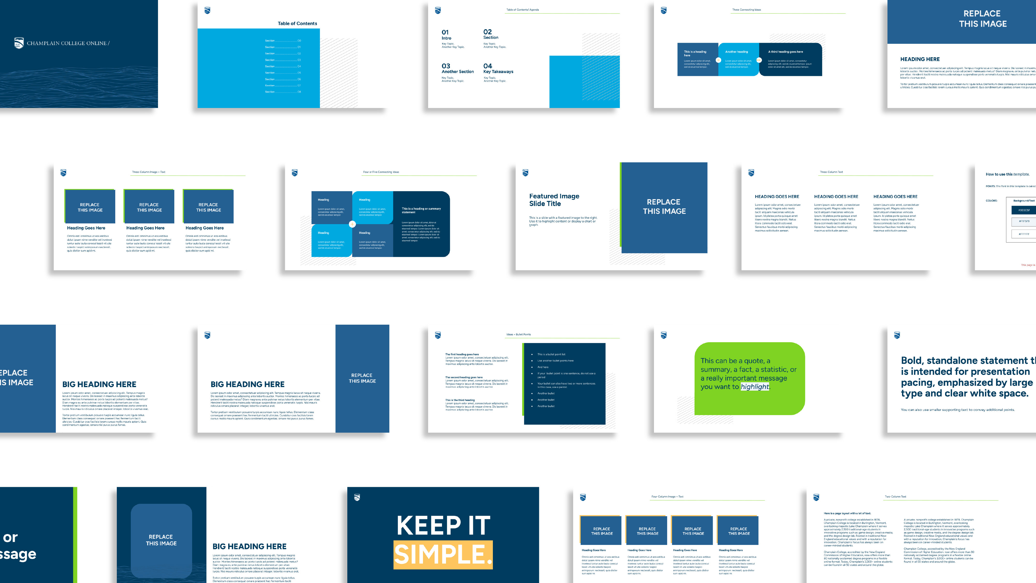
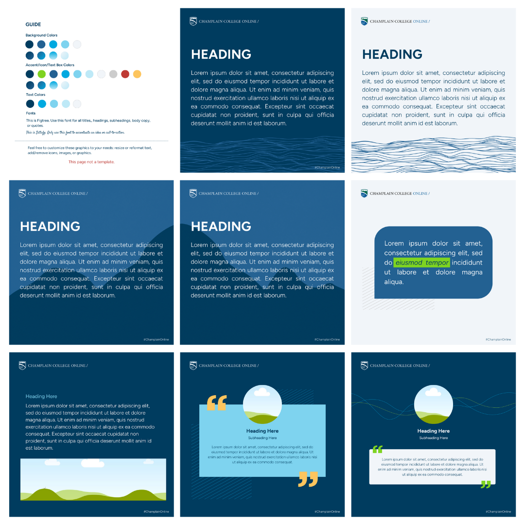
Then, I moved on to creating a Google Slides presentation template. This organization relies heavilyyyyyyyyyy on presentations: webinars, courses, program proposals, marketing reports, enrollment reports, etc. So, this had to be good.
I also created social media templates, as well as templates for email banners, blog headers, and other digital communications channels.

Overall, I really wanted all these elements to feel modern and visually appealing. When you’re managing a digital brand, the visual identity becomes very important. People will lose trust and interest when your graphics, website, and any design elements don’t appeal to them or look outdated. That was the problem for CCO—so much of the previous marketing materials and brand design was too serious, too classic. Their idea of targeting the “modern learner” wasn’t connecting with who the brand was, which was my main challenge to overcome.

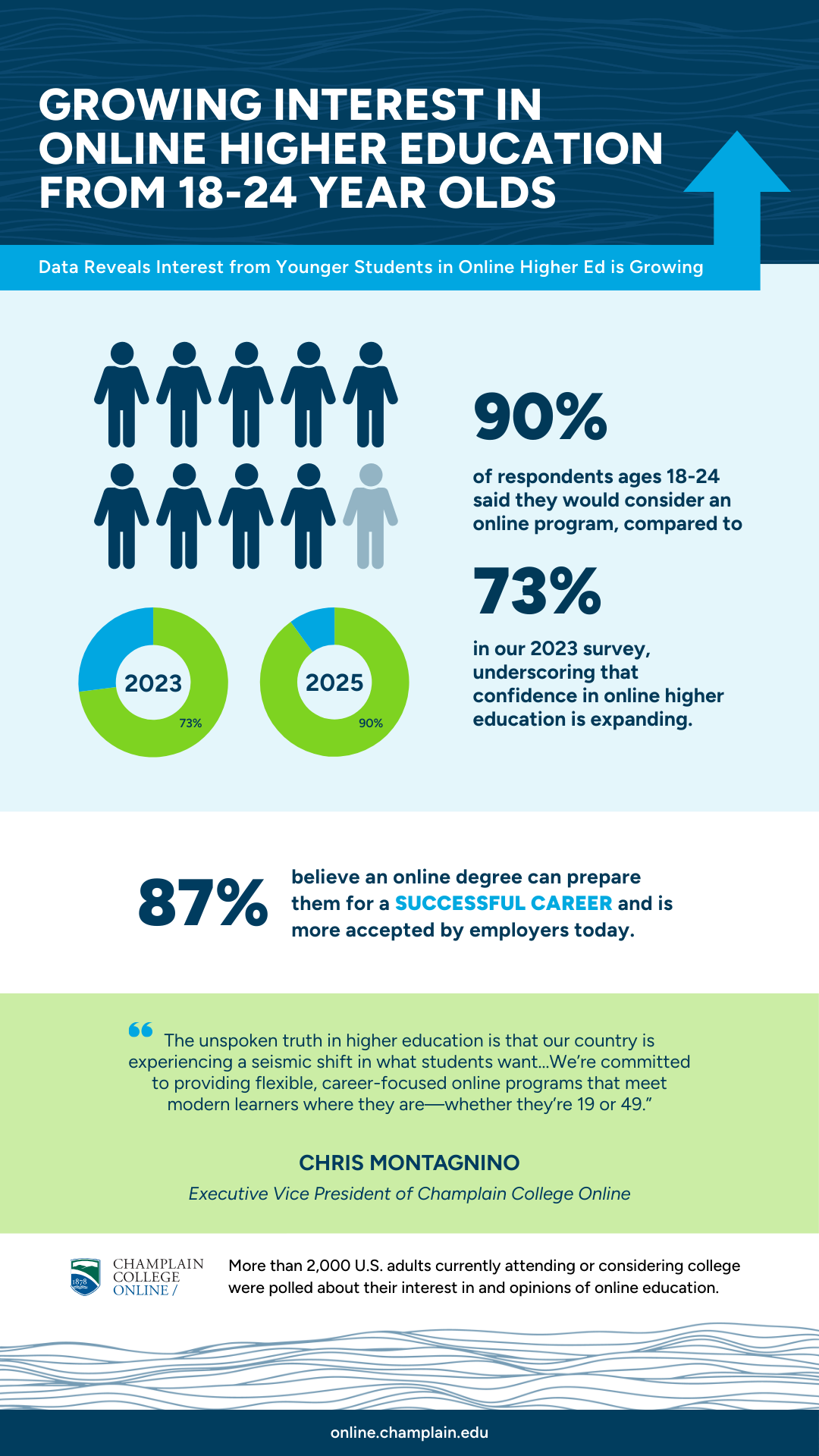
Of course, I needed to make some extra elements just for fun. I always try to create as many mockups and designs as I can (within reason), so the team can see how this new brand identity can be used in different scenarios. Sometimes, a brand will like an idea and actually go ahead with it.
My sticker designs actually got printed! I was proud of that.